Houston-Based. Nationwide Service.
Houston-Based. Nationwide Service.
Modernizing a logo is not the same as replacing it. We work out which parts of your mark are actually carrying recognition, keep those, and rebuild what has aged — so regulars barely notice and everyone else sees a company that looks current.
The central question in any redesign is not aesthetic. It is: what are customers actually recognising? Sometimes it is a shape. Sometimes it is a colour so strongly associated with the business that changing it would confuse people at a distance. Sometimes it is nothing more than the arrangement of the name, and the rest is free to change.
Answering that honestly determines the scale of the work. A business whose mark is genuinely known in its market has real equity to protect, and a dramatic change destroys value that took years to accumulate. A business whose logo nobody could describe from memory has nothing to protect, and pretending otherwise just constrains the design for no benefit.
The second question is what has actually aged. In our experience it is rarely the concept. Typography dates fastest, because typeface fashions move and letterforms carry period signals strongly. Colour reproduction is next: palettes that were mixed for one printing process often look muddy everywhere else. Third is detail that never worked small and has become more obvious as more of your presence moved onto screens.
The company is respected and the mark is not. The gap between reputation and presentation has become noticeable to everyone except the people who see it daily.
The original was made cheaply or quickly when the business was smaller. It no longer matches what the company has become.
The mark illustrates a product or service that is no longer the main business. The identity is describing the wrong company.
It was designed for print and now lives on phone screens, app icons and social avatars, where the detail disappears entirely.
Two identities need to become one, or a parent and sub-brand relationship needs to be expressed visually.
The logo exists only as a low-resolution image and every reproduction has degraded a little further from the original.
There is a specific and uncomfortable moment most owners describe. You see your logo next to a competitor’s on a listing, a proposal or a shelf, and for the first time you notice that yours looks older. Nothing has changed about your work. Something has changed about the comparison.
The temptation is to fix it quickly, and that is where redesigns go wrong. A rushed change tends to discard exactly the elements customers were using to recognise you, while keeping the ones that made it look dated. The result is a mark that feels unfamiliar to existing customers and still unconvincing to new ones.
The alternative is slower by a few days and much safer. Establish what carries recognition, change everything else, and plan the transition so your van, your invoices and your website are not showing three different versions for six months.
If there is genuinely nothing worth preserving — a new name, a new company, or a mark nobody recognises — you are better served by starting from a blank artboard than by constraining the work with an old design.
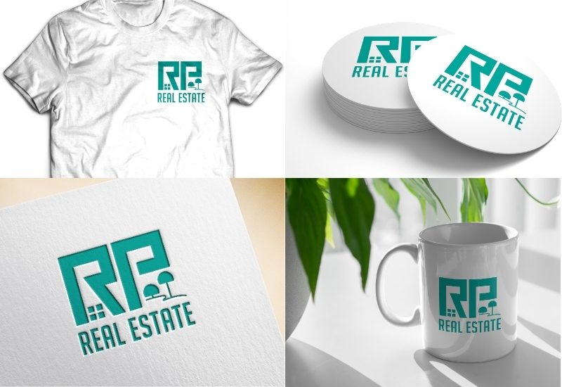
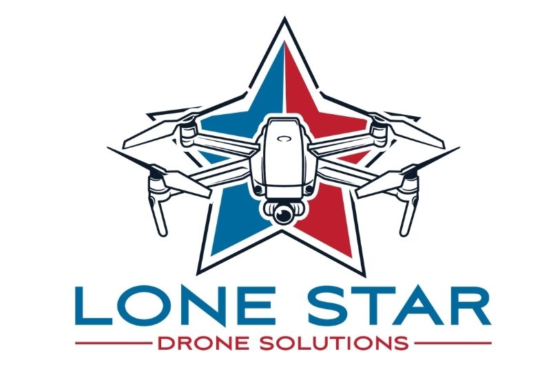
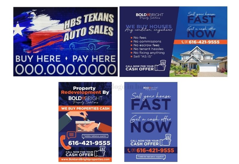
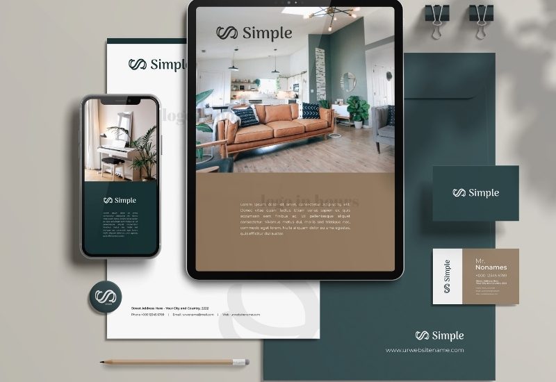
Examples of modernized marks showing how construction, typography and colour change while the underlying recognition is preserved. Shown to demonstrate approach rather than to claim clients.
Existing customers still identify you instantly, because the elements they were actually using to recognise you are still there.
Detail that vanished in an app icon or a social avatar is resolved, so the logo behaves everywhere your business now appears.
Values are redefined so print, screen, vinyl and thread agree with each other instead of drifting apart.
Many redesigns are the first time a business has ever owned a proper vector source file for its own mark.
Horizontal, stacked, single-colour and reversed versions, so nobody has to improvise when placing it.
You get an order of operations for updating signage, vehicles, print and digital rather than doing it randomly.
Most of a redesign is diagnosis before it is drawing. These are the specific things we examine, and what we typically do about each.
Where only a raster image survives, the mark is redrawn as vector rather than auto-traced. Tracing reproduces every flaw in the original at higher fidelity, which is the opposite of what a redesign needs.
Dated letterforms are the single strongest ageing signal. Replacement is rarely a straight font swap; spacing, weight relationships and often individual characters are adjusted so the new type sits correctly.
Detail is removed in order of how little it contributes at small size. The test is whether the silhouette remains distinctive once internal detail is gone.
Palettes are re-specified in defined values that translate across processes, usually with fewer colours than the original carried.
Modern identities need more than one lockup: a full version, a reduced version, and sometimes a symbol-only mark for avatars and app icons.
Alignment that is mathematically correct often looks wrong. Weights, centring and spacing are adjusted by eye at the sizes the mark will really be seen.
Where the existing logo survives only as a JPG or PNG and the design itself is still sound, rebuilding it as vector artwork may be all you actually need — and it costs less than a redesign.
We look at where it currently appears, how it reproduces, and which elements are doing recognition work.
Refresh, evolution or rebuild. This is a commercial decision as much as a design one, and we give a recommendation.
The specific elements that must survive are written down before drawing starts, so nothing is lost by accident.
Options shown against the current mark rather than in isolation, because the comparison is the point.
The chosen route is tested small, in one colour, and against real applications before being called final.
Full variant set plus a practical order for rolling the change out across signage, print and digital.
Clean vector source in AI and EPS, redrawn rather than patched.
A direct comparison you can use internally to explain the change.
Horizontal, stacked and where useful a symbol-only mark for small spaces.
Full colour, single colour and reversed, with defined colour values.
PDF, PNG, JPG and SVG prepared from the new master.
A practical rollout order so the change does not look accidental.
Redesign work starts from $125 with nothing paid upfront. Where a project sits depends mostly on how much has to be rebuilt rather than adjusted.
A refresh — corrected typography, tightened spacing, a cleaner colour specification on an otherwise sound mark — sits at the lower end. A rebuild that has to recover artwork from a low-resolution image, resolve a mark that never worked small, and produce a full responsive variant set is more work and priced accordingly.
One thing worth knowing before you budget: the redesign is often the cheaper half of the change. Replacing signage, re-lettering vehicles and reprinting stationery usually costs more than the design. That is an argument for timing a redesign to coincide with replacements you were going to make anyway.
Our pricing page sets out what sits at each level and what moves a project up.
Most redesigns run a few days from first review to final files. The audit and the decision about scale of change usually take longer than people expect, and the drawing usually takes less.
Redesigns benefit from more time than new logos rather than less, for one reason: the decision about what to protect is worth getting right, and it is difficult to make well under pressure. If a deadline is forcing the pace, say so early and we will scope accordingly.
Where a logo was produced by an AI tool and the problem is execution rather than age, that is a distinct service — see refining AI-generated logos.
Three different scales of change, with genuinely different risks and costs. Most businesses assume they need the third and actually need the first or second.
| Light Refresh | Evolution | Full Rebuild | |
|---|---|---|---|
| What changes | Spacing, colour values, minor cleanup | Typography and detail; core shape retained | Almost everything; concept may survive |
| Recognition risk | Effectively none | Low if the protected elements are chosen well | Real, and must be managed deliberately |
| Best when | The mark is sound but sloppy | It looks dated but is genuinely known | The business or name has changed |
| Customer reaction | Not consciously noticed | Reads as tidied up | Reads as a new company |
| Rollout cost | Minimal; often reuse existing signage | Moderate | Full replacement across all material |
| Typical driver | Files are a mess | Competitors look more current | Merger, pivot or rename |
The most expensive error available. Identify the recognition-carrying elements first, in writing, before any drawing begins.
Trends date faster than the mark you already have. A redesign built on this year's aesthetic needs redoing in five years.
Sometimes the mark is fine and the problem is that no vector file exists. That is a conversion job, not a redesign, and costs far less.
New logo on the website, old one on the van, a third version on the invoices. Plan the order before you start replacing anything.
A redesign approved only on screen frequently fails on a sign or a shirt. Test against the real uses before final approval.
Long-serving owners are often attached to elements customers never noticed. Test the assumption before protecting something at the cost of the design.
Long-established firms whose van livery has aged visibly.
Practices modernizing after a partner change or relocation.
Refits and menu redesigns that expose an outdated mark.
Agents updating personal branding alongside brokerage requirements.
Businesses moving from a storefront-first to an online-first presence.
Firms whose reputation has outgrown their presentation.
Fleet refreshes that make re-lettering the natural moment.
Companies entering supply chains with stricter documentation expectations.
If the project is really about building a wider system — palette, typography and usage rules rather than the mark alone — that is brand identity work, and the redesign becomes one part of it.
Logo In Hours LLC is Houston-based and works with businesses nationwide. Redesign work suits remote collaboration particularly well, because the most valuable inputs are photographs of your logo in real use — on the building, the vehicle, the packaging — and those travel perfectly.
Projects run by phone, email and screen share, with the designer doing the work available to you directly throughout.
We establish what is worth protecting before proposing any change.
If a refresh will do, we say so rather than selling a rebuild.
The new master is genuinely constructed, not an upscaled copy.
You get a transition order, not just a file and good luck.
Logo In Hours LLC is a Houston-based logo and graphic design company serving clients nationwide. Redesign projects are handled by human designers working in professional vector software, and every new master is drawn rather than derived from an automatic trace of the old artwork.
We make no claims about awards or client numbers on this page. The useful signal when hiring for a redesign is different anyway: ask whoever you are considering what they would protect in your current mark and why. A designer who answers that specifically has understood the job. One who only talks about the new design has not.
That is the primary constraint we design against. We identify which elements customers actually use to recognise you and preserve them. Handled well, regulars barely register the change while new prospects see a current-looking company.
Broadly: if the mark is sound but the execution is sloppy, a refresh is enough. If it looks dated but is genuinely known, evolution. If the business or name has changed, a rebuild. Send us the logo and we will give you a recommendation.
From $125 with nothing upfront. The figure depends on how much has to be rebuilt — recovering artwork from a low-resolution image and producing a full variant set is more work than tightening an existing vector file.
It is very common and entirely workable. The mark gets redrawn as vector rather than traced. If the design itself is still good, you may only need conversion rather than a redesign.
Yes, and often we should. Colour is frequently the strongest recognition carrier. We usually re-specify the values so they reproduce consistently rather than changing the colours themselves.
That is a normal starting point. Send the logo and photos of it in use, and we will tell you specifically what is ageing it — usually typography, colour reproduction or small-size failure.
No, and most businesses should not. You get a rollout order that prioritises high-visibility items and lets lower-priority material update as it is replaced naturally.
That is designed for explicitly. Modern identities usually need a reduced or symbol-only variant for avatars and app icons, and we supply that as part of the set.
Usually a few days from review to final files. The assessment stage takes longer than clients expect and is worth the time, because it determines everything after it.
Yes, that is the majority of redesign work. We only ask that you have the right to modify the mark — if a previous designer retained ownership, resolve that first.
If the name or positioning is changing, settle that first. Redesigning around a name you are about to replace is avoidable expense.
Yes, including vector source artwork. For a lot of businesses the redesign is the first time they have properly owned their own logo files.
For a light refresh, no — drawing attention to a change nobody noticed creates a question that did not exist. For a substantial rebuild, a short explanation helps, particularly with long-standing customers who might otherwise wonder whether they are dealing with the same company. Keep it brief and lead with what has not changed.
Keep them. Archive the previous artwork somewhere retrievable rather than deleting it. You may need the old mark for historical documents, warranty paperwork, existing signage that has not yet been replaced, or simply to show the before-and-after. It costs nothing to retain and is awkward to recover once gone.
That happens, and it is a legitimate outcome. If the assessment concludes the mark is sound and only the files are the problem, we will tell you that rather than talk you into a redesign.
Share your existing mark and a couple of photos of it in real use. You will get a straight assessment of what is worth keeping, what is ageing it, and whether you need a refresh, an evolution or a rebuild.
Free Consultation • No Upfront Charge