Houston-Based. Nationwide Service.
Houston-Based. Nationwide Service.
AI tools are genuinely good at producing an idea. They are much less good at producing a file you can manufacture. We take what you generated and rebuild it properly — real curves, real typography, real colour values, and files a printer or sign shop will accept.
AI generators have become genuinely useful for exploration. They let you see an idea in minutes, try directions you would not have described in words, and arrive at a conversation with a designer already knowing what you like. That is real value, and there is nothing wrong with starting there.
The difficulty is structural rather than aesthetic. Most generators output a raster image — a grid of pixels — or a vector produced by automatically tracing one. Neither is how professional artwork is constructed. A traced file carries hundreds of anchor points sitting slightly off the intended curve, which is invisible on screen and very visible once something is cut, printed large or stitched.
The second recurring issue is text. Image models generate letterforms that resemble type rather than being type. Look closely at generated logos and you will often find a letter that does not exist, inconsistent stroke weights across the same word, or spacing no typographer would set. It reads as almost-right, which is precisely why it undermines credibility.
Refinement fixes both. The concept you chose survives; the execution is rebuilt so the mark can be produced, scaled, and used for years without going back to a generator every time you need a different size.
The concept is right and you are attached to it, but every practical use — printing, signage, embroidery — runs into the same wall.
You were asked for vector artwork and sent a PNG. They can trace it, but the traced version is not quite your logo any more.
Someone pointed out that a character looks odd, or the spacing is uneven, and now you cannot stop seeing it.
Fine detail that looked rich in the generated preview turns to mush in a favicon, an app icon or an embroidered cap.
A vendor portal, a franchise system or a marketplace requires AI, EPS or SVG and you only have a JPG.
You are genuinely unsure whether to refine what you have or start over, and you would like a straight answer before spending anything.
The sequence is almost always identical. You generate something, you like it, you use it on social media and it looks fine. Months later a real requirement arrives — a sign quote, a uniform order, a packaging run — and the supplier asks for something you do not have.
At that point people usually try one of two things. The first is regenerating at a higher resolution, which produces a different logo rather than a bigger one, because these systems do not reproduce a previous output exactly. The second is running the image through an automatic vectorizer, which produces a file that is technically vector and practically unusable: bloated with anchor points, with curves that wobble and edges that have been guessed from pixels.
Neither is a fix, and both cost time. Manual reconstruction is the route that actually works. A designer rebuilds the mark deliberately, deciding what each curve should be rather than inferring it, and the result is artwork that behaves correctly at every size and in every process.
If your existing mark is not AI-generated but simply an old low-resolution image, the job is vector conversion rather than AI refinement — related work, but a different starting point.
Examples of the construction standards applied when generated concepts are rebuilt: clean curves, real typography, defined colour and full variant sets. Shown to demonstrate approach.
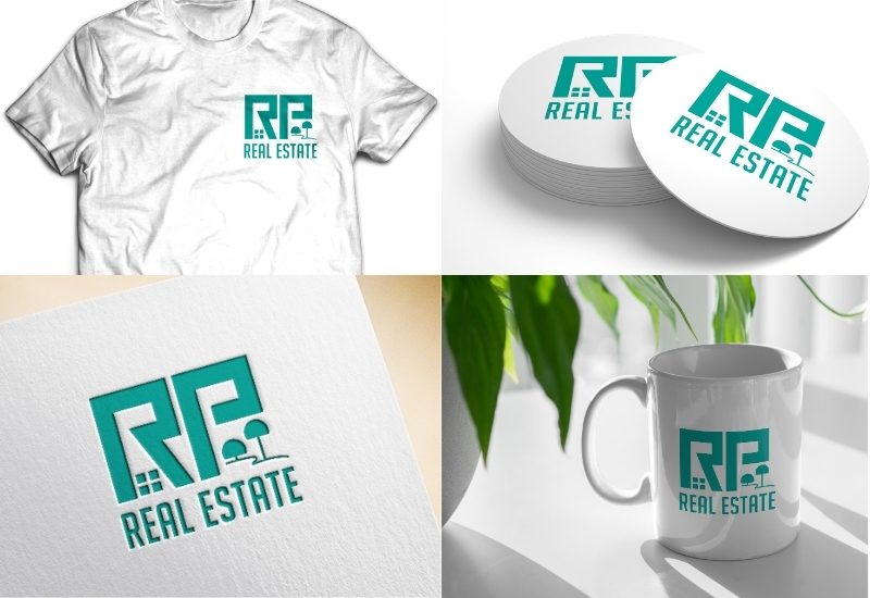
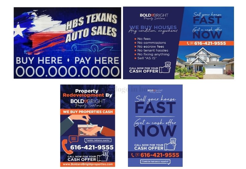
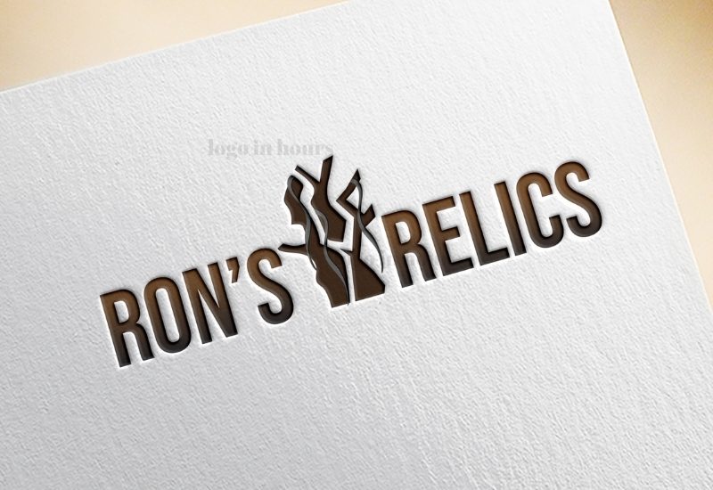
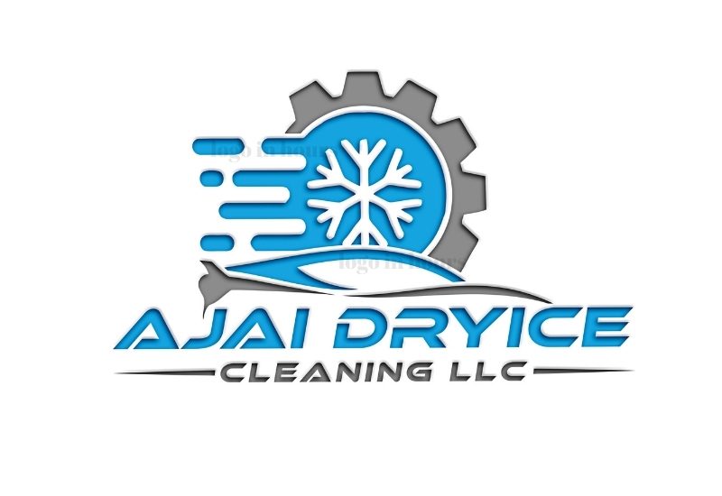
True vector construction means one master drives a favicon and a building sign, with no regeneration and no quality loss.
Real typefaces, properly spaced, with any invented characters rebuilt. The almost-right quality disappears.
Sampled approximations are replaced with defined values that translate across print, vinyl, screen and thread.
You can produce the same logo again next year. Generators cannot reliably reproduce a previous output, which makes them unsuitable as a source of record.
Single-colour, reversed, stacked and horizontal versions, built deliberately rather than exported from a flattened image.
The finished master can be adjusted by any designer later, rather than being a dead image you cannot modify.
These are the specific defects we look for when assessing generated artwork, and what each one requires to fix. Understanding them also helps you judge whether refinement or a fresh start is better value.
The file is pixels. Enlarging it interpolates rather than adds detail, so edges soften and the mark degrades. Nothing can recover detail that was never recorded; the shapes have to be rebuilt as curves.
Vectorized output carries far more anchor points than the form needs, placed where the algorithm guessed an edge. Curves ripple, corners round off, and fabricators cannot cut cleanly from it.
Image models approximate letterforms. Words often contain a character that does not exist in any typeface, inconsistent stroke weights, or terminals that differ across the same word.
Elements that should be symmetrical are not, spacing between repeated shapes drifts, and alignment is close but not correct. Individually subtle, collectively obvious.
Gradients, soft shadows and dozens of near-identical sampled colours are common. Most production processes need a small number of defined colours and no soft effects.
Hairlines, tight internal counters and fine texture disappear when cut from vinyl, stitched, etched or printed small. These are simplified deliberately during reconstruction.
Where the assessment concludes the underlying idea is not worth keeping, we will say so — and designing an original mark from a brief is often better value than repairing a concept that was never quite right.
The generated file at the highest resolution available, plus which tool produced it if you remember.
We tell you whether refining is good value or whether starting fresh would cost you less. Sometimes the answer is the second one.
Which parts of the concept matter to you — the symbol, the arrangement, the colour — so nothing you valued is lost in reconstruction.
The mark is redrawn as true vector curves, with typography replaced by real typefaces and detail simplified where production requires it.
You compare the rebuilt version against your original and we adjust. Most projects tighten proportion and spacing at this stage.
Full variant set in the formats your printer, fabricator and platforms actually require.
AI and EPS artwork, manually constructed rather than traced.
Your original against the rebuilt version, so the difference is visible.
Real typefaces, properly spaced, with invented characters resolved.
A small, specified palette that reproduces consistently across processes.
Horizontal, stacked, single-colour and reversed versions.
PDF, PNG, JPG and SVG generated from the new master.
Refinement starts from $125 with nothing paid upfront. The figure depends on how much of the mark has to be rebuilt rather than adjusted.
A clean generated wordmark that mainly needs proper typography and correct vector construction sits at the lower end. A detailed illustrative mark with soft shading, dozens of sampled colours and malformed lettering throughout is closer to drawing something new, and is priced to reflect that.
This is worth being direct about: sometimes refinement costs more than starting fresh. When the generated artwork needs so much reconstruction that we are effectively drawing a new logo while constrained by someone else’s proportions, we will tell you. You are welcome to proceed anyway if the concept matters to you, but you should know before you commit rather than after.
Full detail on what sits at each level is on our pricing page.
Refinement is often faster than original design, because the direction is already settled. A straightforward wordmark rebuild can frequently be completed within a day; a complex illustrative reconstruction takes longer and should not be rushed.
The assessment itself is quick. Send the file and you will usually get a view on whether it is worth refining, roughly what it involves, and how long it should take, before any commitment.
If a supplier is waiting and the deadline is the binding constraint, same-day turnaround explains what can realistically be finished inside one working day.
A fair comparison, because generators are genuinely good at the part they are good at. The difference shows up in production, not on screen.
| Raw AI Output | Auto-Vectorized | Manually Refined | |
|---|---|---|---|
| File type | Raster image | Vector, traced from pixels | Vector, drawn deliberately |
| Anchor points | Not applicable | Hundreds, placed by algorithm | As few as the form requires |
| Typography | Approximated letterforms | Approximations preserved as shapes | Real typefaces, optically spaced |
| Scaling | Softens when enlarged | Scales, but flaws scale too | Clean at any size |
| Accepted for production | Usually rejected | Often needs rework | Ready as supplied |
| Colour | Many sampled values, gradients | Inherited from the source | Small defined palette |
| Reproducible later | No; regeneration differs | Yes, flaws included | Yes, from an editable master |
| Editable | No | Technically, but painful | Yes, by any designer |
These systems do not reproduce a previous output exactly. You get a different logo, not a larger one, and the inconsistency compounds every time.
It produces a file that is technically vector and practically unusable. Fabricators can tell immediately, and most will ask for something else.
Transparency solves backgrounds, not resolution. A transparent raster still fails the moment it needs to be produced at size.
Malformed characters are the defect other people notice first, and the one owners have usually stopped seeing.
Generated marks often carry dozens of near-identical sampled colours. Production wants a small, defined palette.
Generated output can resemble existing marks. Whether you can protect or safely use a logo is a legal question, not a design one — and it is worth asking a qualified attorney before you invest in signage. We do not provide legal advice.
Generated an identity quickly at launch, now need it to function properly.
Marketplace and packaging requirements expose the file limitations.
Van lettering is usually the moment the problem surfaces.
Packaging print runs demand defined colours and clean vector.
Apparel and embroidery need a proper single-colour version.
Brokerage systems and sign vendors require specific formats.
A deck logo that has to survive being printed and badged.
Generated a mark on a tight budget and now need it to last.
If the mark you generated is replacing a logo customers already know, read how redesign protects existing recognition before you switch — that risk is separate from the file problem.
Logo In Hours LLC is Houston-based and works with clients nationwide. This service suits remote work particularly well, since the entire input is a file: you send what you generated, we send back an assessment, and the work proceeds from there.
Everything runs by phone, email and screen share, with direct access to the designer doing the reconstruction.
Generators are useful for exploration. We handle the part they cannot do.
Redrawn deliberately, never run through an automatic tracer.
Told upfront when starting fresh would be better value.
Output your fabricator accepts without asking for something else.
Logo In Hours LLC is a Houston-based logo and graphic design company serving clients nationwide. Reconstruction is done by human designers in professional vector software, drawing each curve rather than tracing an image.
A practical way to evaluate anyone offering this service: ask whether they will redraw the mark or vectorize it. Those are different jobs with very different results, and a supplier who treats them as interchangeable will hand you a file with the same problems you started with. We are also clear about the boundary of our expertise — questions about whether a generated mark can be trademarked or safely used belong with a qualified attorney, not a design studio.
Usually, yes. The concept is kept and the execution is rebuilt: manual vector reconstruction, real typography, defined colours and full file variants. Send what you have and we will assess it before you commit to anything.
Because the detail was never recorded. Enlarging a raster image interpolates between existing pixels, which softens edges rather than adding definition. The shapes have to be rebuilt as curves to scale properly.
Auto-tracing produces a file with hundreds of anchor points placed where an algorithm guessed the edge was. Curves ripple, corners round off, and most fabricators will ask for something else. Manual redraw avoids all of it.
Image models approximate letterforms rather than setting type. Generated wordmarks often contain a character that exists in no typeface, uneven stroke weights, or spacing no typographer would use. It reads as almost-right, which is worse than obviously wrong.
That is the objective. You tell us which parts of the concept matter, and reconstruction preserves them while fixing execution. Most clients describe the result as the logo they thought they had.
From $125 with nothing upfront. A clean wordmark rebuild sits at the lower end; a detailed illustrative mark with heavy shading and malformed lettering costs more because it is closer to drawing something new.
No, and we will tell you when it is not. If the artwork needs so much reconstruction that we are effectively drawing a new mark while constrained by someone else’s proportions, starting fresh is often better value.
That is a legal question and depends on jurisdiction and the specifics of how the mark was produced. We are designers, not attorneys, and we do not give legal advice. Speak to a qualified trademark attorney before investing heavily in signage or packaging.
Vector source in AI and EPS, plus print-ready PDF, transparent PNG, flat JPG and SVG, with full-colour, single-colour and reversed versions in both lockups.
That is part of the reconstruction. Detail that thread cannot hold is simplified deliberately and a proper single-colour version is built rather than flattened from the full-colour mark.
Often faster than original design, because the direction is already decided. A straightforward wordmark rebuild can frequently be done in a day; complex illustrative work takes longer.
Not required, but useful. It tells us what you were reaching for, which occasionally reveals that the generator missed something you actually wanted.
No. Generators are a genuinely useful way to explore ideas quickly and arrive at a clear brief. They are simply not a way to produce manufacturable artwork, and that is the gap this service fills.
Attach the file at the largest size you have and tell us what you like about it. You will get a straight assessment of what needs rebuilding, what it will cost, and whether refining or starting fresh is the better use of your money.
Free Consultation • No Upfront Charge