Houston-Based. Nationwide Service.
Houston-Based. Nationwide Service.
A logo identifies you. A brand identity makes everything else you produce look like it came from the same company — colour, typography, layout and usage rules that anyone can apply consistently, including people you have not hired yet.
The clearest way to understand the difference is to imagine handing your materials to someone new. Given only a logo file, they will make reasonable-looking choices that happen not to match anything you have produced before — a different blue, a different typeface, different spacing. Given an identity system, they will produce something that looks like it came from your company, because the decisions were already made and written down.
That is the practical value, and it compounds. Every printer, web developer, signage supplier, freelancer and new employee who touches your materials is making dozens of small visual decisions. Without a system, each one drifts slightly, and after three years your brand is an average of everyone who happened to work on it. With a system, they converge.
An identity is not a bigger logo project. The logo is one component. The rest — how colours relate, which typeface carries a heading versus body text, how much space surrounds things, what photography should feel like — is where consistency actually comes from. Most businesses that feel inconsistent have a perfectly good logo and no system around it.
If you generate flyers, posts and proposals every week, the cost of re-deciding basic visual questions each time is larger than the cost of settling them once.
The moment more than one person creates material, consistency stops being achievable through memory and needs to be written down.
Printers, developers and agencies each need specifications. Supplying them is faster and cheaper than correcting the results afterwards.
Each location will produce local material. Guidelines are what keep those recognisably part of the same business.
Fundraising, franchising or entering retail all bring visual scrutiny and requirements a single logo file cannot satisfy.
You can tell your materials do not match but cannot say why. The answer is almost always an absent system rather than a bad logo.
Most businesses arrive at identity work through frustration rather than ambition. Someone lays the website, the brochure and the trade show banner side by side and notices they do not look related. The logo is the same on all three. Everything around it is different.
That happens because a logo answers one question and materials pose hundreds. Which blue exactly? What typeface for a heading, and which weight? How large should the logo be relative to the page? How much space around it? What should photography look like? Absent documented answers, each person answers reasonably and differently, and the aggregate reads as improvisation.
The fix is not more design work piece by piece. It is deciding the recurring questions once, writing them down, and testing them against real applications so the rules are known to work rather than merely plausible.
If you do not have a mark yet, that is the starting point rather than this — custom logo design comes first, and the system is built around it afterwards.
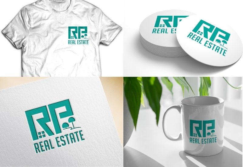
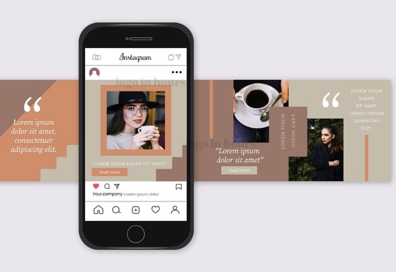
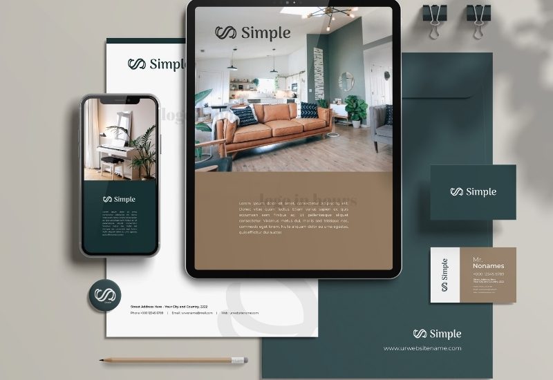
Examples showing how a single set of decisions carries across applications — lockups, colour variants and material treatments derived from one system.


Suppliers and staff produce on-brand material because the rules are written down, not because someone checks every file.
Recurring visual decisions are already settled, so each new piece starts further along instead of from scratch.
Printers and developers quote more accurately and revise less when they receive specifications rather than an impression.
Consistent colour and type build familiarity over years. Inconsistent materials reset that recognition each time.
Coherence across materials is one of the strongest available signals that a business is larger and more settled than it may be.
The system outlasts whoever currently makes your materials, which is exactly when most brands quietly drift.
These are the components we build, and what each one is actually for. A system missing any of them tends to fail at the point where that component would have made the decision.
Not one file. A primary lockup, a horizontal and stacked arrangement, a symbol-only mark for avatars and app icons, a single-colour version and a reversed version — each with a defined minimum size and clear space.
A palette is not a list of colours; it is an assignment of roles. Which colour dominates, which supports, which is reserved for calls to action, and which neutrals carry text. Values are specified for print, screen, vinyl and thread so they match across processes.
Typically two families used across defined weights and sizes: what a heading is, what a subheading is, what body text is, and what a caption is. A scale removes the recurring question of how big something should be.
A consistent spacing unit and margin logic. This is the least visible component and often the one most responsible for materials looking related or not.
Guidance on what photography should feel like, how images are treated, and whether icons are line or solid, and at what weight — so image choices stop being arbitrary.
What must not be done: no stretching, no recolouring outside the palette, no placing the mark on busy imagery, minimum sizes observed. Rules prevent the most common ways identities are degraded by well-meaning users.
Where an existing mark is being carried into a new system but has aged, modernizing it first is usually the right sequence, so the system is built around the version you intend to keep.
What the business does, who it serves, how it wants to be perceived, and which competitors it sits beside in a customer's mind.
We look at everything you currently produce to find what is working, what is inconsistent, and what is already doing recognition work.
A visual territory agreed before detail work — tone, level of formality, and how distinct from category conventions you want to sit.
Logo family, colour roles, typographic scale, spacing logic and imagery direction developed together rather than sequentially.
The system is applied to real materials — a card, a document, a social post, a sign — because rules that work in theory sometimes do not in practice.
Written guidelines plus organised asset files, structured so a supplier can use them without a briefing call.
Primary, horizontal, stacked, symbol-only, single-colour and reversed versions.
Palette with defined roles and values for print, screen and production.
Chosen families with a documented scale for headings, body and captions.
Spacing units, margins, and clear-space rules around the mark.
The system shown on real materials so the rules are demonstrably workable.
Written usage rules you can hand to any supplier or new hire.
Identity work starts from $125 with nothing paid upfront. It sits above single-logo pricing for a straightforward reason: an identity is several deliverables plus documentation rather than one mark.
The main variable is depth. A compact system — logo family, colour roles, two typefaces and a short usage document — suits most small businesses and is the common starting point. A fuller system adds imagery direction, iconography, extended layout templates and applied examples across many materials, and is worth it for businesses producing at volume or across multiple locations.
Judged per use, identity work usually gets cheaper the longer you hold it. A system used across hundreds of pieces over several years costs very little per application, whereas re-deciding basic questions on every project carries a cost that never stops recurring.
Our pricing page shows how identity work compares with standalone logo and design projects.
Identity projects run longer than single-logo work, typically over a small number of weeks rather than days. The build itself is not the slow part — discovery, the audit of existing material, and testing the system against real applications are, and each is worth its time.
Compressing an identity project is generally a false economy. A system approved without being applied to anything is a set of assumptions, and the failures show up later on your materials rather than in a review.
Individual pieces produced from the finished system — brochures, banners, packaging — are covered under graphic design services.
Both are legitimate choices and the right one depends on how much material you produce. A business making a handful of things a year genuinely may not need a system yet.
| Logo Only | Full Brand Identity | |
|---|---|---|
| What you receive | One mark and its file variants | Logo family, colour, type, layout and rules |
| Colour | The colours in the logo | A palette with defined roles and production values |
| Typography | Whatever is in the wordmark | A documented hierarchy for all materials |
| Consistency | Depends on whoever makes each piece | Built in and written down |
| Briefing a supplier | Send a logo and explain verbally | Send guidelines; far less back-and-forth |
| Best for | New or small businesses producing little | Businesses producing material regularly |
| Cost | Lower upfront | Higher upfront, lower per piece over time |
| Risk | Gradual visual drift | Under-use if materials are rarely produced |
The logo is one component. Colour roles, typographic hierarchy and spacing rules do more day-to-day work in keeping materials consistent.
A sixty-page document gets ignored. A short, specific one that answers the questions people actually face gets used.
Eight colours with equal status is not a system. Without defined roles, every user picks differently and consistency fails.
Systems approved only as presentation boards routinely fail on a business card or a sign. Apply before signing off.
Two families used well across their weights outperform five used once each, and are far easier for others to apply correctly.
Avatars, favicons and app icons are now among the most frequent appearances of a mark. A system without a symbol-only variant leaves people improvising.
Consistency signals reliability where the product itself is intangible.
Patient-facing material and signage that must read as competent and calm.
Fleet, site and document consistency across crews and subcontractors.
Menus, packaging, interiors and delivery platforms in one voice.
Packaging systems that hold together across an expanding product range.
Brokerage and agent material that stays coherent across many individuals.
Class material, apparel and studio graphics produced continuously.
Campaign and donor material created by volunteers and staff alike.
If the mark you are building the system around was generated with an AI tool, it will usually need rebuilding as proper artwork first — a system is only as reliable as the files underneath it.
Logo In Hours LLC is Houston-based and works with businesses nationwide. Identity projects involve more conversation than most design work, and that conversation happens by scheduled calls and screen share regardless of where you are.
The deliverables — asset files and a written guidelines document — are digital, which means they reach every supplier and team member you have, wherever they are.
Colour roles, type scale and spacing logic, not a logo with extras.
Guidelines written so a supplier can act without a briefing call.
Applied to actual pieces before the system is signed off.
Told honestly when a logo alone is all your business currently needs.
Logo In Hours LLC is a Houston-based logo and graphic design company serving clients nationwide. Identity systems are built by human designers in professional software, documented in writing, and delivered as organised asset files rather than a folder of exports.
We will also tell you when you do not need this. A business producing a handful of materials a year gets very little from a guidelines document and would be better served by a well-drawn logo and good files. Identity work earns its cost through repetition, and if the repetition is not there yet, it is worth waiting until it is.
A logo is a single identifying mark. A brand identity is the system around it — logo family, colour roles, typographic hierarchy, spacing rules and imagery direction — that makes everything you produce look like it came from the same company.
It depends on how much material you produce. If you make a handful of things a year, a well-drawn logo and good files may be sufficient. If several people produce material regularly, a system saves money and prevents drift.
Logo variants with minimum sizes and clear space, the colour palette with defined roles and production values, the typographic scale, spacing principles, imagery direction and a short list of things not to do.
Identity design creates the system; graphic design applies it to specific pieces. The identity decides which blue and which typeface; the graphic design project produces the brochure using them.
From $125 with nothing upfront, sitting above single-logo pricing because it comprises several deliverables plus documentation. Depth is the main variable — a compact system versus a full one with imagery direction and templates.
Usually a small number of weeks rather than days. Discovery, auditing existing material and testing the system on real applications take the time, and compressing them tends to produce a system that fails later.
Yes, and that is common. If the mark is sound we build around it. If it is dated or exists only as a low-resolution image, we would usually recommend addressing that first.
We start from them. Often the work is defining roles and production values for colours you already use informally, rather than replacing them.
Far more reliably than they follow verbal instructions, provided the document is short and specific. Printers and developers generally prefer receiving specifications — it reduces their revision work too.
Yes. Systems should evolve as a business does. Because everything is documented, changes are deliberate and can be applied consistently rather than drifting.
We specify them and advise on licensing. Font licences are usually purchased by the business directly, since they are held in your name. Where budget matters we can build the system on high-quality open-source families.
That is precisely the problem a system solves. Written rules and organised asset files remove the ambiguity that causes well-meaning people to improvise.
Send examples of everything you currently produce, including the pieces you are unhappy with. Those are usually the most informative starting point.
Send us what you currently produce — the good and the inconsistent. You will get an honest read on whether you need a full identity system or simply better logo files, and a clear scope for whichever it is.
Free Consultation • No Upfront Charge