Houston-Based. Nationwide Service.
Houston-Based. Nationwide Service.
The Walmart logo isn’t just a sunny symbol—it’s a reflection of a powerful brand promise: low prices, accessibility, and warmth. That six-rayed spark at the end of the Walmart name represents more than design—it represents optimism, innovation, and customer-centered thinking. For designers and business owners, it’s a clear example that a well-thought-out logo can become the heart of a brand’s identity.
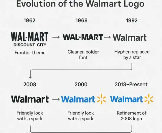
Let’s take a closer look at how Walmart’s logo evolved and what it teaches us about building logos that are both meaningful and memorable.
At first glance, the Walmart logo appears minimal: simple blue text with a bright yellow spark. But its meaning runs deep.
The spark—sometimes called the “spark symbol” or “sunburst”—has six lines symbolizing six key values:
It also resembles a light bulb or the spark of an idea—symbolizing forward thinking and smart savings. It evokes the feeling that Walmart isn’t just a place to shop—it’s a place where ideas and value come together.
Walmart’s logo redesign in 2008 was a major shift from its former bold, all-caps font. The current version uses:
This move reflected Walmart’s desire to appear more approachable, modern, and emotionally connected to its customers.
Much like the Amazon logo, this clean and friendly visual approach helps build trust, familiarity, and comfort—especially across digital platforms.
Walmart has had several logos since its founding in 1962. Early versions emphasized low prices with bold, hard-hitting typography. As Walmart grew into a global brand, its image had to evolve too.
The 2008 redesign by Lippincott, a global brand strategy and design firm, marked a turning point. It replaced the harsh black and blue color palette and sharp lines with something more human and optimistic.
It was more than a logo change—it was a cultural shift.
The Walmart logo is a great example of how less can say more. Here’s what creatives and entrepreneurs can learn from it:
The spark is small, but it says everything. You don’t need complicated elements to express depth.
Colors and shapes matter. Walmart’s blue builds trust, and its yellow evokes warmth and cheer.
Rebranding is sometimes necessary. As businesses grow, so must their image.
The spark looks great on everything—from receipts to smartphone apps—just like all great logos should.
Designers often get asked, “Can you make a logo like Amazon or Walmart?” The real question is—can we build a logo that reflects a business’s values just as clearly?
Walmart’s logo shows that a logo should be strategic, emotional, and scalable. For businesses, this means:
Like any major brand, Walmart uses both PNG and vector formats for its logo to maintain quality, consistency, and scalability.
✅ PNG Format
Perfect for web use, social media, and email signatures due to transparency and compact size.
✅ Vector Format (SVG, AI, EPS)
Used for print, signage, packaging, and merchandise—scales without loss of quality and is editable for professional use.
Whether you’re a startup or a retail giant, both formats are essential for maintaining your brand identity across mediums and ask logo design firm to ensure that.
Walmart’s clean, optimistic design is a source of inspiration for logo designers across various industries:
By blending function with feeling—just like Walmart’s logo—you can create brand marks that connect, convert, and endure, whether you plan to do business in Texas, California or Florida.
The Walmart logo proves that branding success doesn’t require complexity—just clarity, purpose, and emotional connection. It’s a symbol that invites customers in, makes them feel welcome, and reminds them of the values behind the prices.
If your logo can do even a fraction of that, you’re on the path to building a brand that truly resonates.
Free Consultation • No Upfront Charge