From A to Z: What the Amazon Logo Teaches About Branding
The Amazon logo is more than a design—it’s a blueprint for business success. That iconic smile-shaped arrow from A to Z speaks volumes: a clear mission, a focus on customer satisfaction, and the ability to scale. For designers and business owners alike, it’s a powerful reminder that branding isn’t just about looking good—it’s about communicating purpose. Amazon’s logo shows us how simplicity, clarity, and strategy can work together to build something truly memorable. As the brand evolved, so did its identity—proving that great logos grow with great businesses. In the end, your logo isn’t just a mark; it’s your brand’s silent ambassador.
Let’s break down the journey of one of the most iconic logos of our time—and how it quietly changed the rules of branding.

A Logo That Sells Everything… from A to Z
At first glance, the Amazon logo looks modest: just the brand name in a clean sans-serif font with a curved yellow arrow underneath. But look closer.
The arrow stretches from the “A” to the “Z”—a subtle but brilliant message that Amazon sells everything. It’s a visual shorthand for endless inventory and convenience. But it does more than that.
The arrow also forms a smile, reinforcing customer satisfaction, delight, and approachability. It's not just clever design—it’s brand psychology at its finest.
Simplicity with Depth
The genius of the Amazon logo lies in its simplicity with purpose. There are no gradients, flashy effects, or complicated symbols. Just three elements:
-
A bold, clear font
-
A warm yellow arrow
-
Strategic placement
This minimalism is intentional. It reflects Amazon’s promise to make shopping simple, seamless, and reliable.
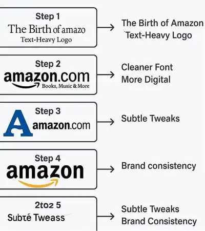
Evolution of the Logo: From Books to Everything
When Jeff Bezos launched Amazon in 1994, it was an online bookstore. The original logo featured a stylized “A” shaped like a river. But as the company expanded beyond books, the branding needed to evolve.
By 2000, Amazon introduced the logo we know today—designed by Turner Duckworth, a global branding agency. It was built to scale with the company’s ambitions, growing from e-commerce to logistics, cloud services, streaming, and beyond.

Why It Inspires Designers and Startups
The Amazon logo proves that design isn't just art—it’s strategy. Here’s what makes it such a valuable inspiration for others:
1. Function Over Flash
It’s not about being trendy—it’s about being timeless. The Amazon logo is just as relevant today as it was over two decades ago.
2. Subtle Storytelling
A small design element (the arrow) carries a massive brand message. It encourages designers to find deeper meaning in small details.
3. Emotional Impact
That smile isn’t accidental. It's a reminder that great logos make people feel something, not just recognize a name.
4. Versatility
From boxes to apps, billboards to business cards—the logo works everywhere. That’s powerful identity design.
What You Can Learn From Amazon’s Logo
Whether you’re a startup founder or a graphic designer, here’s the big takeaway:
Your logo is not just your name—it’s your brand promise.
Amazon teaches us that every curve, color, and character matters. If you can communicate your mission, values, and customer focus in one mark—you’ve won half the branding battle.
Using the Amazon Logo to Guide Powerful Logo Design Concepts for Businesses
Business owners always search the logo designer near me to find the best local Logo designers who can take powerful cues from the Amazon logo when helping businesses develop their branding. The Amazon logo is a perfect example of how design can communicate a company’s mission, values, and customer promise—without saying a word. By studying its iconic arrow that doubles as a smile and spans from A to Z, designers learn to create logos that tell a story, evoke emotion, and build trust. For businesses, this approach turns a simple graphic into a strategic tool—one that supports marketing, reinforces identity, and fuels long-term growth. Whether it's symbolizing customer satisfaction, range of service, or ease of experience, logo design rooted in Amazon-style thinking results in brands that connect, convert, and last.
Why the Amazon Logo Is Used in PNG and Vector Formats
The Amazon logo, like any professional brand asset, is used in PNG and vector formats to maintain quality, clarity, and flexibility across various platforms.
✅ PNG Format (Raster)
-
Used for: Websites, presentations, social media, app interfaces
-
Why it's used:
-
Supports transparent backgrounds, ideal for placing over any color
-
Delivers high-quality visuals in smaller file sizes
-
Compatible with most digital platforms
-
✅ Vector Format (AI, SVG, EPS, PDF)
-
Used for: Print materials, merchandise, signage, scalable designs
-
Why it's used:
-
Scalable to any size without losing resolution (unlike JPG/PNG)
-
Perfect for professional printing (banners, uniforms, packaging)
-
Easily editable by designers using tools like Adobe Illustrator
-
In essence, PNG is ideal for screen use, while vector formats are essential for professional printing and brand consistency. Logo design works always include these. That’s why major brands like Amazon provide their logos in both formats to partners, vendors, and media.
Amazon Logo Inspiration for Logo Design Across Industries
The Amazon logo is a goldmine of inspiration for creating logos in any industry. Its clever use of an arrow—from A to Z—combines simplicity with storytelling, showing how even a minimal design can convey mission, range, and customer satisfaction. For realtors, a subtle icon like a home-shaped outline integrated into a letterform can suggest trust and accessibility. Electrical , Transportation and moving companies can take cues from Amazon’s motion-filled arrow to design logos that imply speed, direction, and reliability. In clothing, a logo can weave in a visual thread, hanger, or folded element to reflect variety and style. Construction logo can build their identity around strong shapes like beams or rooftops that align with durability and trust. And for restaurants, a playful twist—like a spoon doubling as a smile or flame—can express warmth and hospitality. Just like Amazon’s logo, these industry-focused designs can combine emotional appeal with functional meaning to create logos that truly connect and communicate.
Final Thoughts
The Amazon logo isn’t iconic by accident. It’s the result of strategic thinking, intentional simplicity, and emotional design. It tells a story without saying a word—and in doing so, it inspires designers around the world to create logos that don’t just look good, but mean something.
So the next time you spot that smiling arrow on your package, remember: behind it is a blueprint for branding success.


